The User Services Online (USO) system provides a user-friendly interface designed to facilitate
interaction with the system. The interface is built using modern web technologies and follows best practices
for usability and accessibility. The design is responsive, ensuring that it works well on a variety of devices,
from desktop computers to tablets and smartphones. The interface is intuitive, with clear navigation and
consistent layout across different pages. It is designed to minimize the learning curve for new users while
providing advanced features for experienced users. The interface includes visual cues, such as color coding and icons,
to help users quickly understand the status of their proposals, projects, and other items within the system.
The USO user interface is organized into several key components, each serving a specific purpose
and providing a consistent user experience. These components include the dashboard, icon tools, side-bar menu,
page header, notification area, profile menu, list pages, and detail pages.
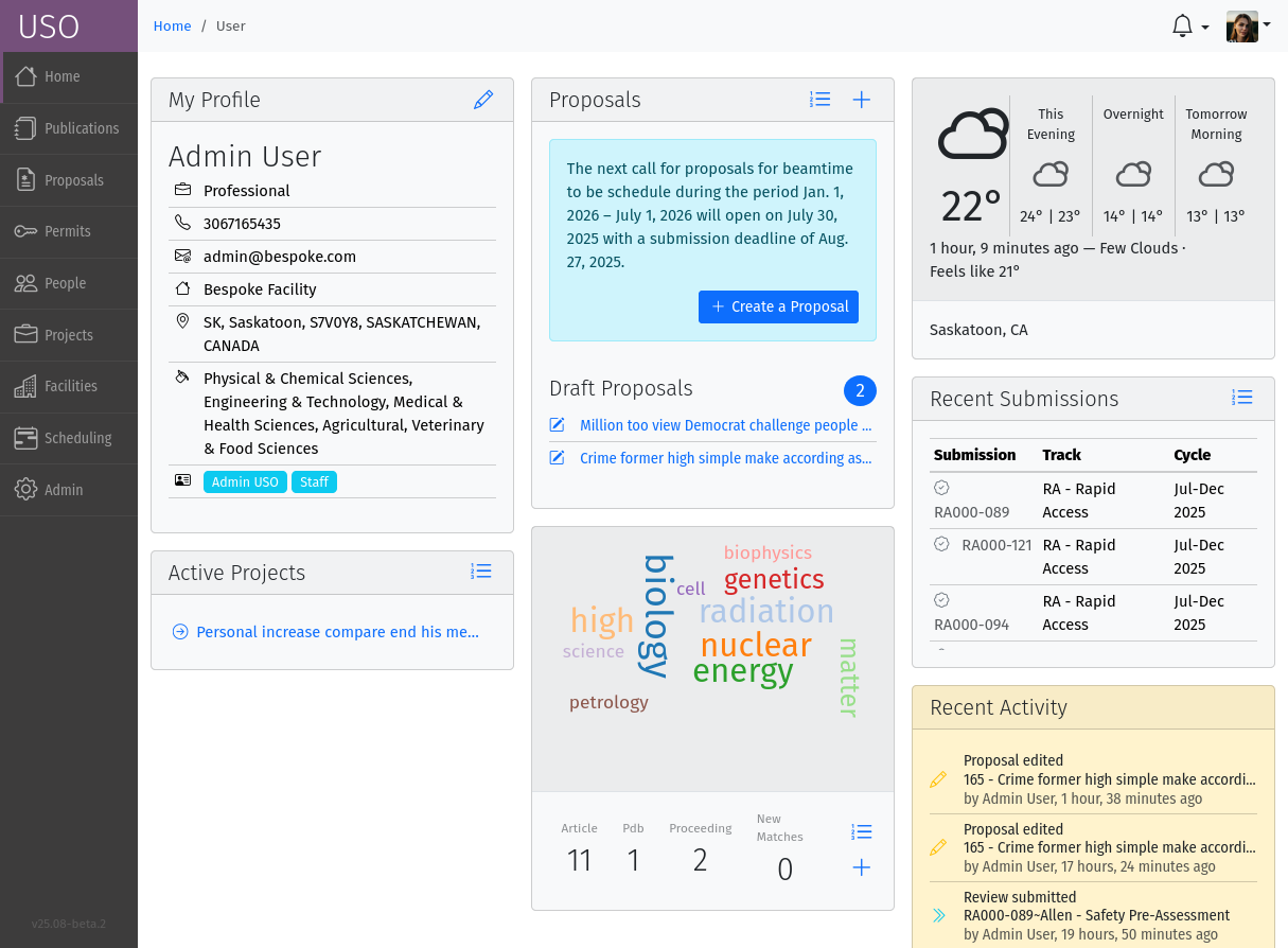
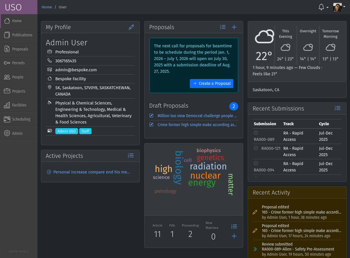
The dashboard is the landing page of the user and contains a number of panels which summarize various
pieces of information relevant to the current moment in time. Most of the information presented on the dashboard
can be accessed in more detail through other pages in the USO system. The specific panels visible will depend on the
user’s roles. Each panel may have a descriptive header or contain relevant icon tools for performing various actions
relevant to the content of the panel.
The Page Header is at the top of the dashboard and contains the breadcrumbs for navigation on the left and notification
and profile menus on the right. The page header is always visible on all pages of the USO system.
Screenshot of the dashboard showing the Side-bar menu with icon tools, the profile menu
and various dashboard panels.
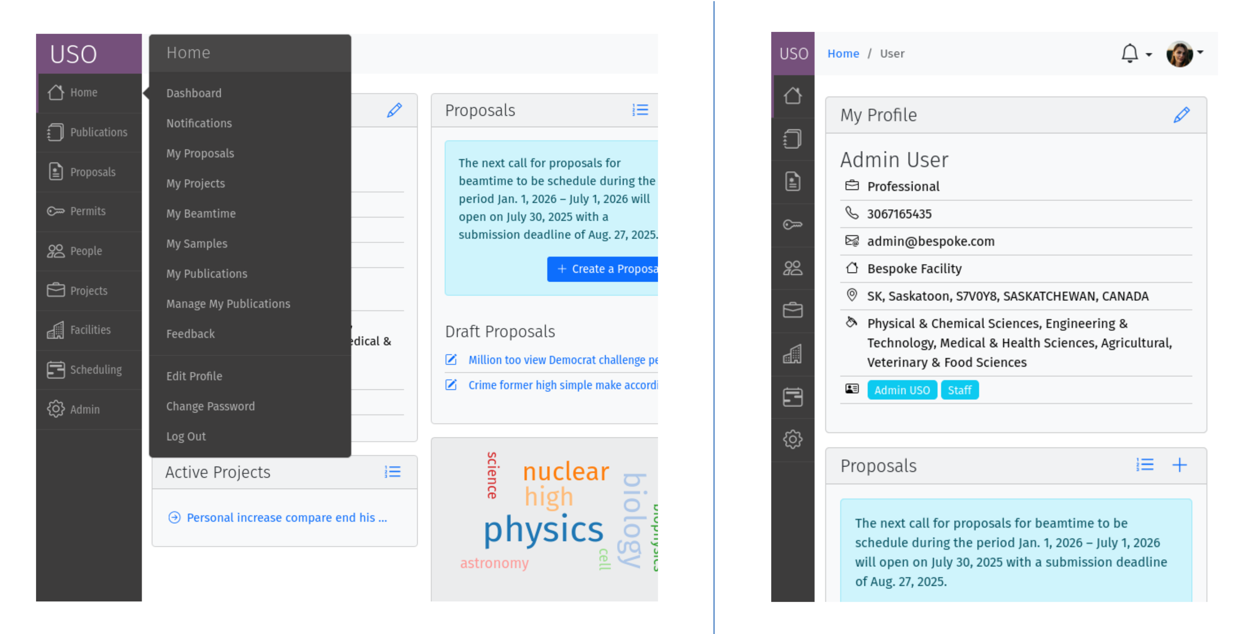
The dark vertical area to the left of the window with multiple icon tools. Clicking
on the items in the menu expands the menu to show a sub-menu. The specific
items visible on your menu will depend on your roles. On small screens, the text labels of the menu items
are hidden and only the icons are shown. However, hovering over the icons will show the text labels.
Screenshots of the side-bar menu showing an open sub-menu.
The menu items are grouped by categories such as Home, Proposals, Projects, … etc. The menu is always
visible on the left side of the screen. As can be seen in the screenshot on the right, the side-bar menu
is responsive and adapts to small screens by hiding the text labels and showing only the icons.
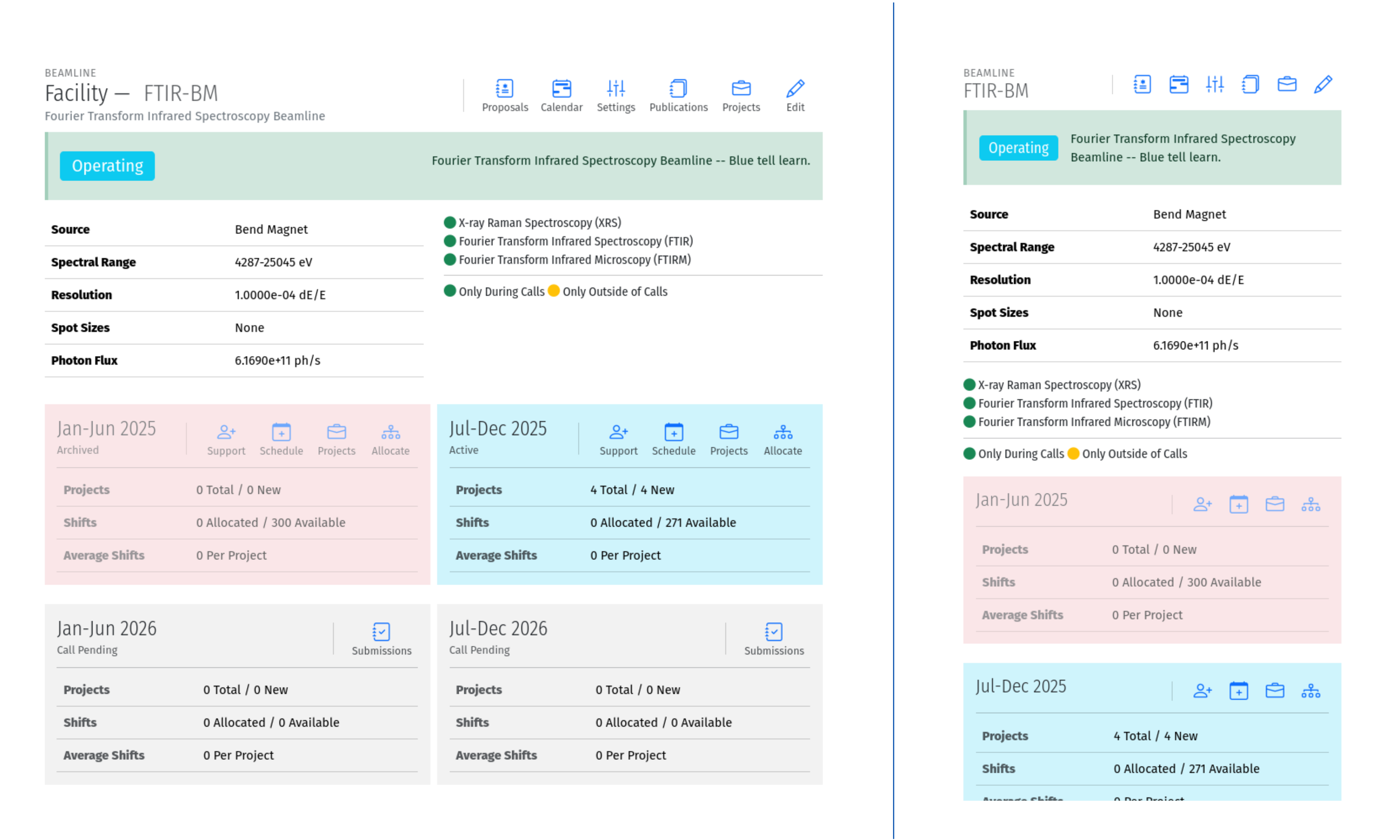
An icon with a descriptive text to the right or underneath. For example, Submit
Single-clicking on the tool initiates an action such as opening a form or a pop-up, or redirecting to another page. On
small screens, or when more space is needed on the screen, only the icon is shown. Multiple icon tools are
sometimes grouped together in a tool bar, on the top-right corner of a page or parts of a page to provide
a collection of actions that a user may perform in the given context. such as the “Proposals” panel on the dashboard.
Screenshots of the icon tools on a beamline detail page. The icon tools are grouped together in tool bars.
On the right, the same page is shown on a small screen where the text labels are hidden and only the icons
are visible.
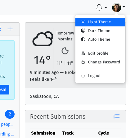
The profile menu contains links for performing actions related to the account of the currently logged-in user.
The profile menu can be activated by clicking on the photograph at the far right of the header region.
Screenshot of the open profile menu showing available actions. This include setting the display theme,
editing your profile, or changing your password.
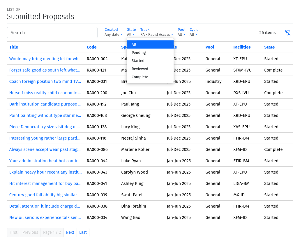
A list view, is a page which presents a table of items (eg, lists of samples, proposals, projects, etc).
List pages enables users to view all entries in table format, search through them, sort and order them
based on different fields (or columns) and filter them based on status, or other properties such as
modification date. It may sometimes be possible to add new entries from the list page. In some cases,
single-clicking on a row of the table redirects access to the detailed page for the selected item, or
presents a form to allow editing the details of the selected item. All list pages follow the same
paradigms and often contain a search box, list filters, item counts, list tools, a list header, and
pagination tools.
Screenshot of a List Page showing search pagination and filtering capabilities.
When the list has been filtered either by a search or through filters, a “clear-filters” icon will be
visible next to the number of items. Clicking on this icon resets the list to its default. The pagination
buttons at the bottom of the list allow users to navigate through the pages of the list when the list is too long
to fit on a single page. Some list pages also include a tool bar at the top of the list, which contains
icon tools for performing actions on the list, such as creating a new item.
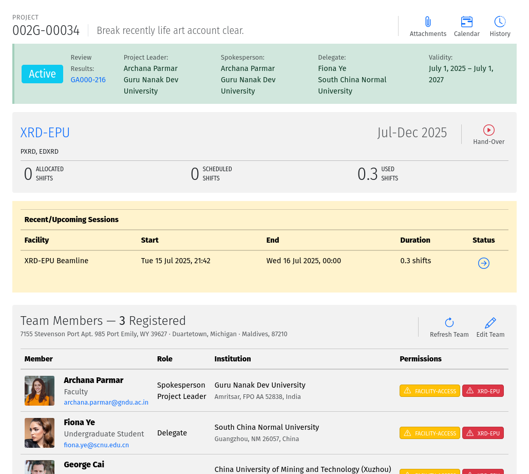
A detail page is a page which presents information about a specific item in the system (eg. Proposal,
Submission, Project, Session, Beamline etc). Detail pages also follow the same paradigms and often contain
a header region, a tool area, a status area and a content area. The content area may vary significantly from
one object type to another and may also vary based on the state of the object. The status area may
have a colored background which provide visual cues about the state of the object.
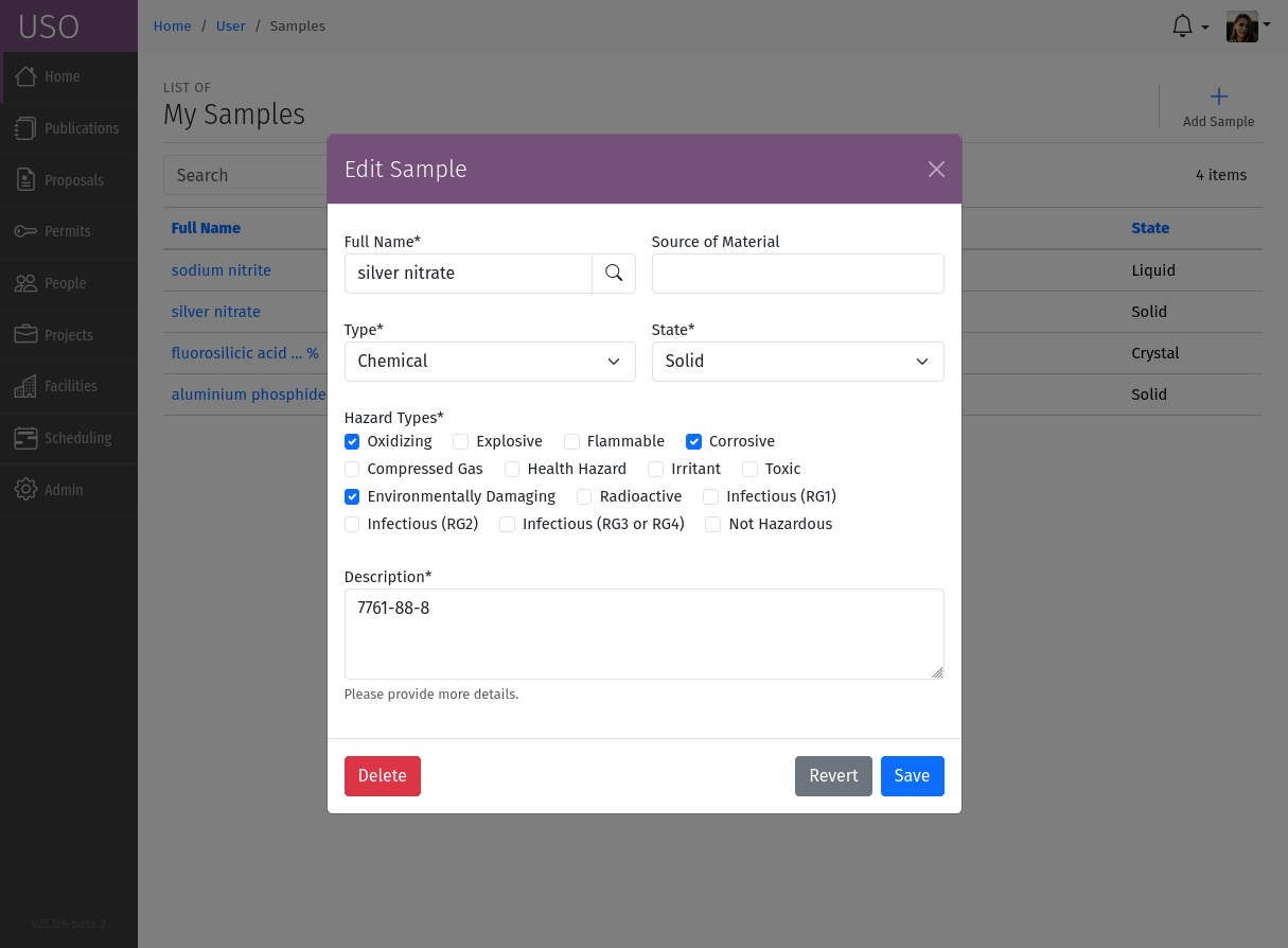
A modal pop-up is a small window that appears on top of the current page, allowing users to perform actions
without navigating away from the current context. Modal pop-ups are often used for editing or creating new items,
confirming actions, or displaying additional information. They typically include a form with input fields,
buttons for submitting or canceling the action, and may also include validation messages to guide users in
completing the form correctly.
Screenshot of a modal pop-up used for editing a sample.